BRIEF: BELONGING/NOT BELONGING
CONCEPT TITLE: COLLECTIONS
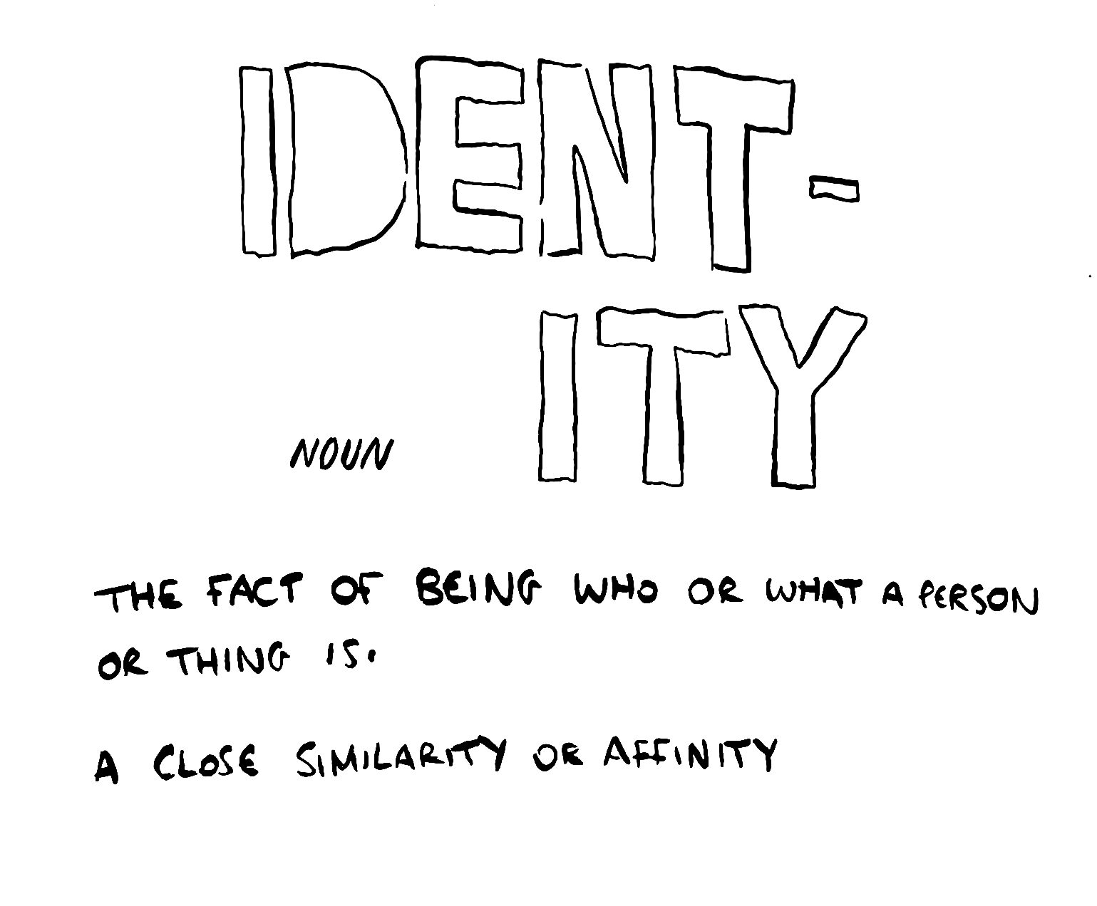
Utilizing Childlike Imagery to Convey Nuanced Ideas of Belonging in a Children’s Book
I created a mood board on Pinterest, where I collected a diverse range of illustrations that evoked strong emotions and expressions. These illustrations featured qualities such as rich analog textures and a deeply emotive atmosphere.
While curating the mood board, I noticed common elements among the selected illustrations. These included the use of traditional or painterly techniques, which conveyed a sense of depth and raw emotion. These qualities aligned with the emotions I aimed to capture in my work. The mood board provided a visual reference that guided the aesthetic direction of my project. It has been a valuable source of inspiration and a reference point for maintaining consistency in my work.


Research & Influences:
My research began with a critical evaluation of the concept of belonging. I also wanted to explore the idea of NOT belonging,- I felt really drawn to the phrase “fish out of water” and wanted to play with ideas around that. I found this phrase interesting and explored how to represent it visually in different ways, both explicitly and covertly. This exploration led me to consider the concept of collective nouns, which I recognised as a powerful metaphor for collective identity and the experience of belonging
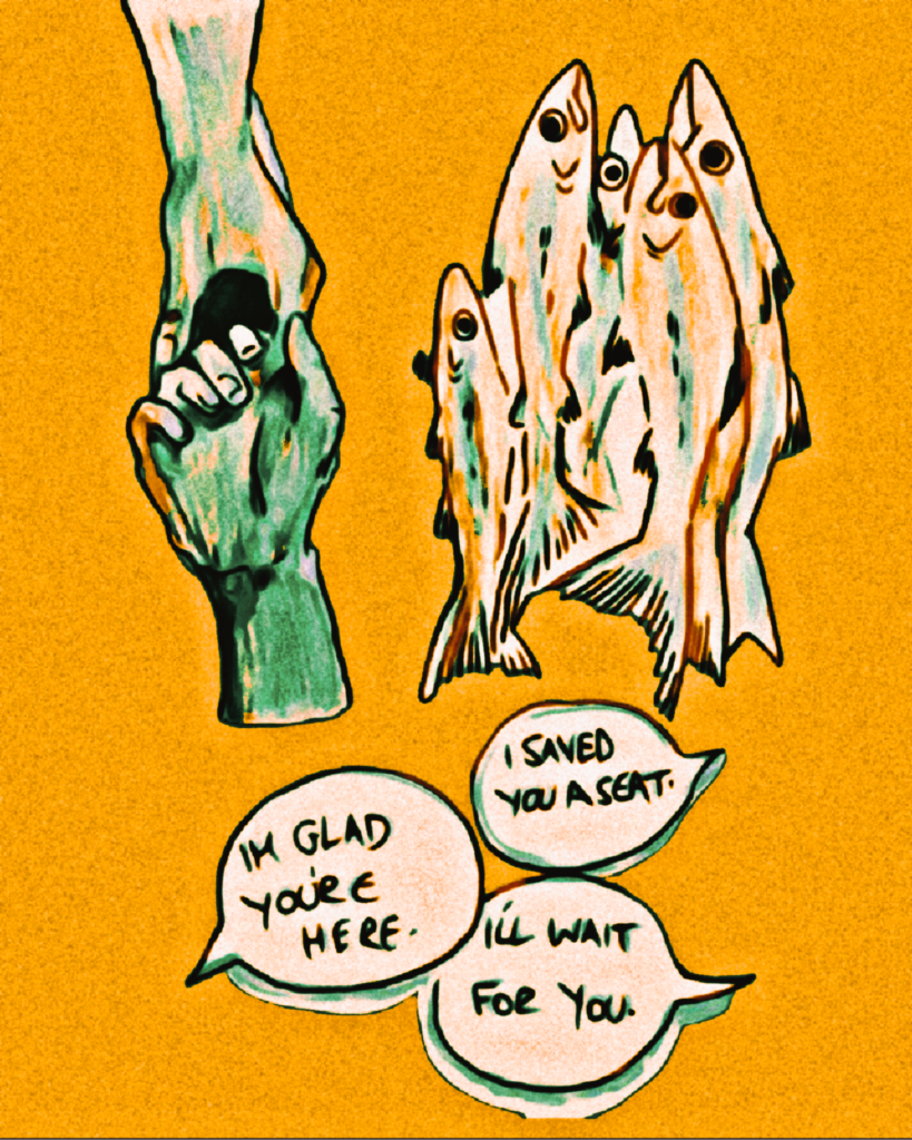

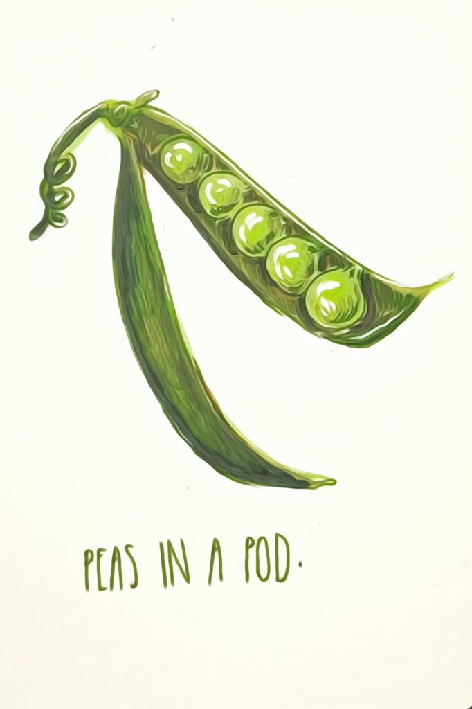


I decided to focus on the contrasting phrases ‘peas in a pod’ and ‘fish out of water’ as central concepts for my illustrations. ‘Peas in a pod’ represents the idea of belonging and togetherness, while ‘fish out of water’ symbolizes feelings of otherness and not fitting in
These concepts offer a rich and contrasting emotional spectrum that allows me to explore a range of emotions and experiences related to identity. They provide a framework to depict the complexity of belonging and not belonging.
By choosing these concepts, I aimed to create illustrations that go beyond the surface and delve into the deeper emotional layers of identity. These concepts challenge me to convey nuance and depth in my work.


The mind map helped me identify the central theme of ‘belonging,’ which resonated deeply with me. This theme intrigued me because it can be both a source of comfort (‘peas in a pod’) and a cause of discomfort (‘fish out of water’) in people’s lives. The mind map served as a valuable starting point, helping me clarify my project’s direction by highlighting the aspects of identity I wanted to explore further.

To infuse playfulness into my work and explore a distinctive style, I embarked on a captivating journey. I sought to craft illustrations of fish that would capture the essence of ‘belonging’ to a world that defied the ordinary. To achieve this, I took a rather unconventional approach – I drew images of fish based on other people’s descriptions.
I reached out to friends, family, and even strangers, inviting them to find an image of a fish and describe it to me without me being able to see the image. The instructions were simple but intriguing – describe the fish and highlight the features they found most notable. This approach introduced an element of delightful surprise and unpredictability into the creative process . Asking individuals to describe fish without visual reference encouraged a diverse array of interpretations. People’s descriptions often varied widely, reflecting their unique perspectives and experiences. This process mirrored the diversity of human identities and experiences. Each description provided a glimpse into the individual’s world, their lens on what makes a fish distinctive and notable.

David Shrigley’s distinctive naive drawing style and his use of wit and humour in art have always captivated me. I’m particularly drawn to how he pairs images with related text to create a narrative.
Shrigley’s work offers a unique way to communicate complex ideas through seemingly simple visuals. The integration of humour and text can make the viewer engage with the work on multiple levels, which aligns with my goal to evoke emotional responses.
I see Shrigley’s influence as a valuable source of inspiration. While I don’t aim to replicate his style, I want to learn from his approach to inject wit, humour, and layered meaning into my illustrations.
This project delves into the multifaceted concept of belonging and alienation through the lens of collective nouns. Inspired by the playful and mischievous works of Jon Klassen (“I Want My Hat Back”) and Lauren Child, I aimed to create a children’s book that utilized a seemingly naive aesthetic to grapple with progressively mature themes.


Artists like Jon Klassen and Lauren Child significantly influenced the development of the book’s visual style. Their ability to create work that resonates with both children and adults through playful and textured illustrations aligned perfectly with my vision for the project. Analysing these works allowed me to understand how the juxtaposition of childlike visuals and mature themes can create a sense of unease, humour, or even deeper meaning.


Stemming from a desire to explore the concept of a ‘children’s book, gone wrong’, I was fascinated by the idea of using a seemingly innocent and playful aesthetic to address more mature and complex themes. My research delved into existing works that tread this line, such as the ‘adult Ladybird’ series, which takes classic children’s literature and infuses it with adult humour and social commentary. Ricky Gervais’ ‘Flanimals’ series also provided inspiration, showcasing a world populated by fantastical creatures grappling with adult themes like mortality and existentialism, all presented through a visually whimsical lens.


The adult Ladybird books, for instance, utilise the familiar visual style of Ladybird books from our childhood, but subvert it with unexpected content, prompting a sense of surprise and amusement.

Similarly, Gervais’ illustrations in ‘Flanimals’ maintain a certain cuteness, despite the dark realities faced by the creatures. This dissonance between form and content served as a significant influence on my approach to creating a children’s book that tackles complex issues in a nuanced way.


INKTOBER
Inktober’s daily prompts pushed me to create quickly and think creatively, improving my ability to develop ideas rapidly. The result was a collection of illustrations that served as a visual diary, showcasing my progress and experimentation with different styles and themes. Inktober helped refine my style and provided a foundation for the dark, whimsical tone of my final book.


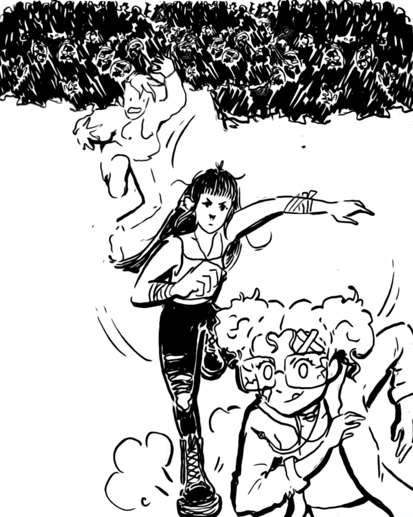

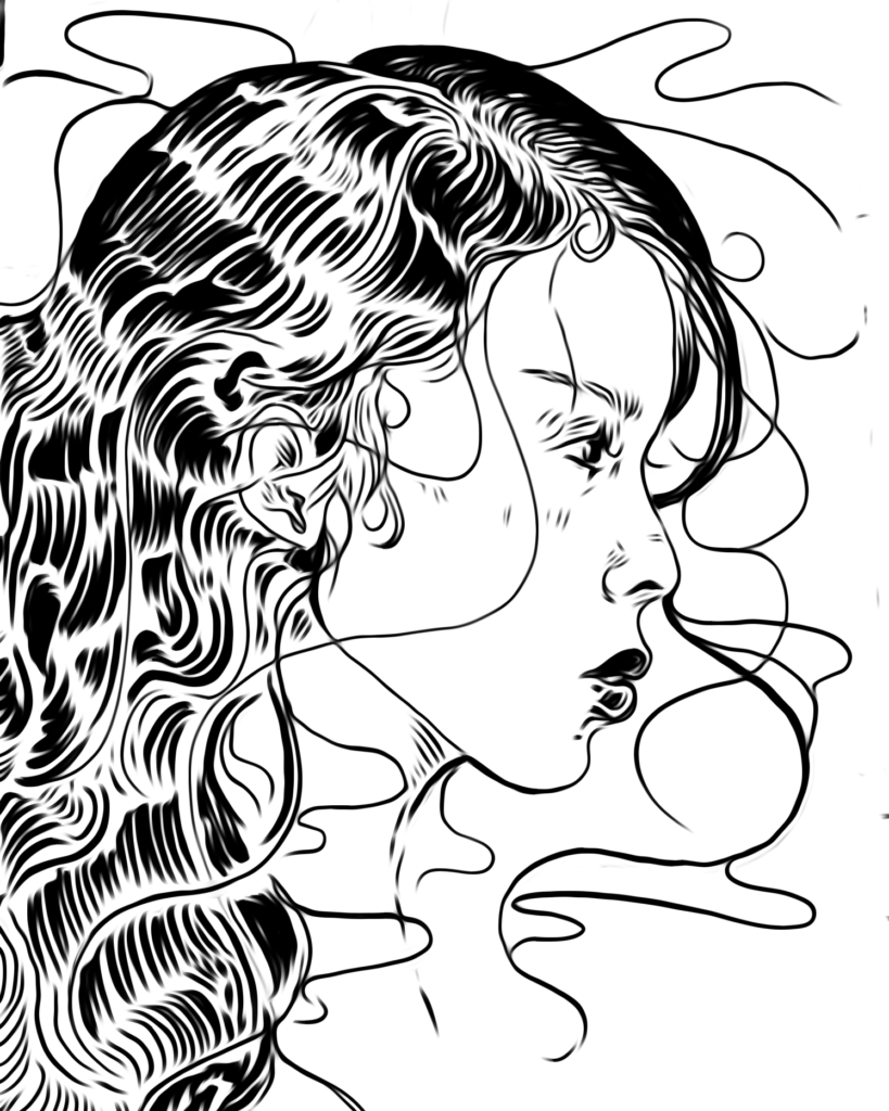
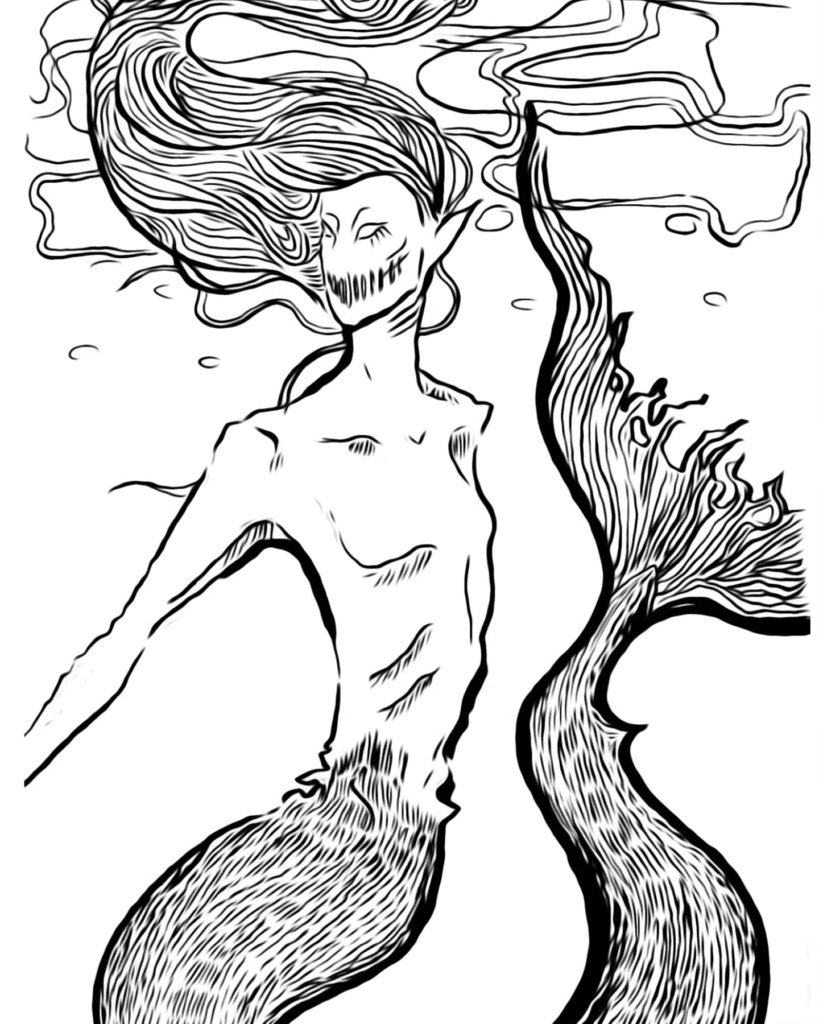
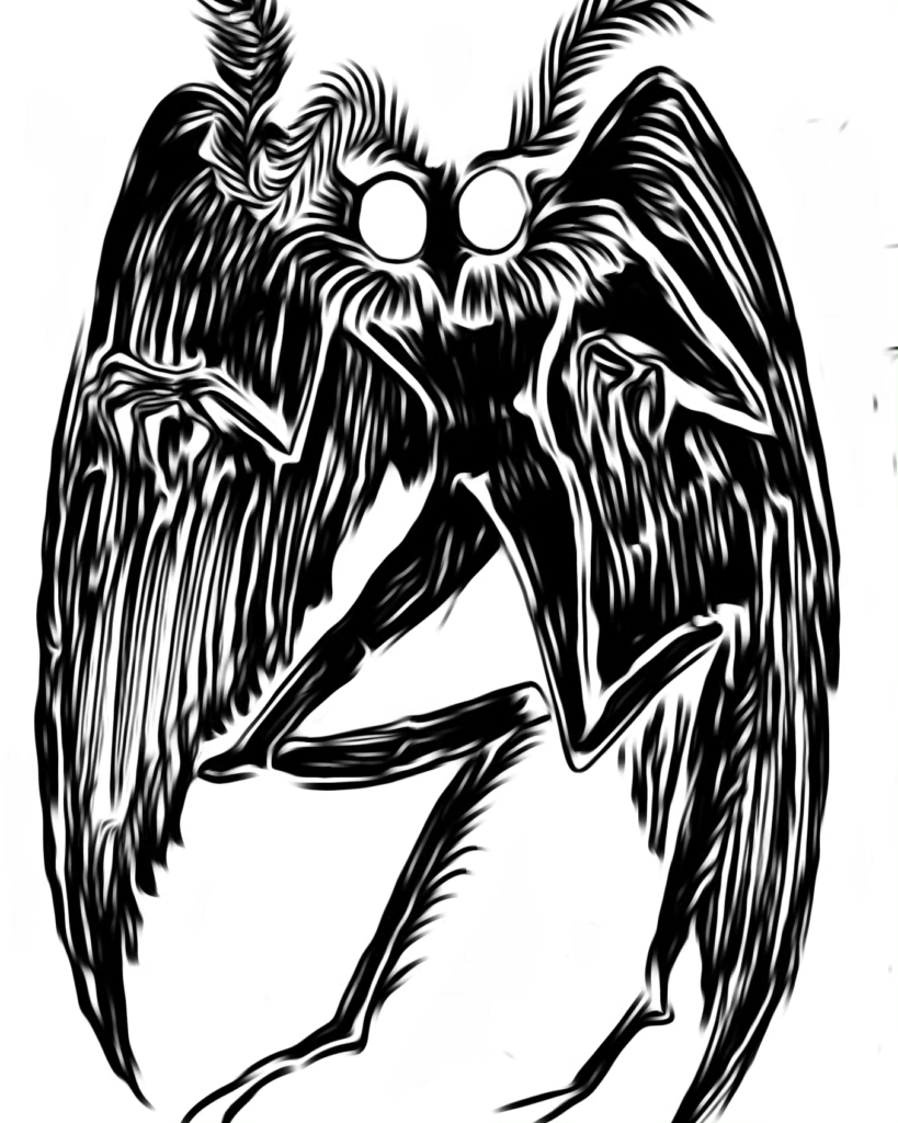
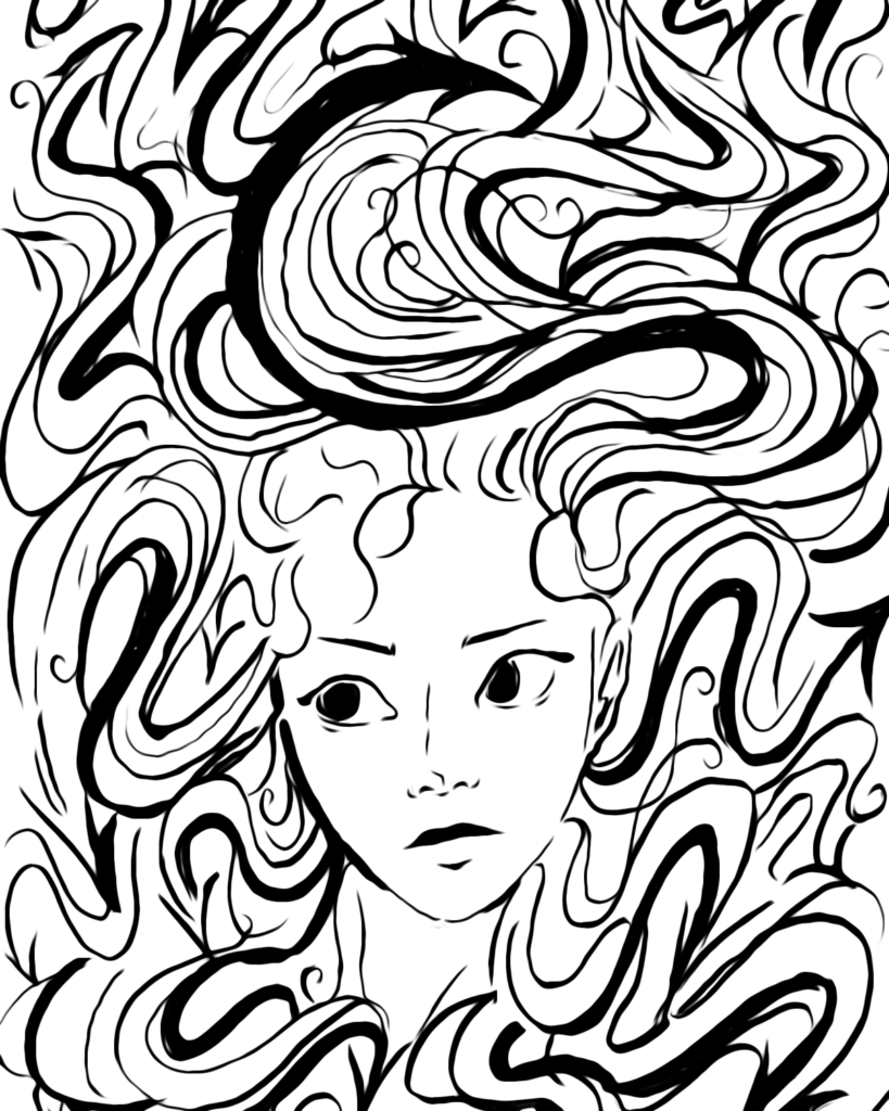
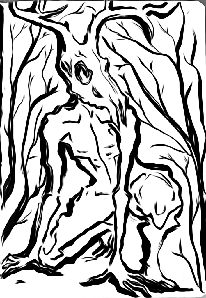
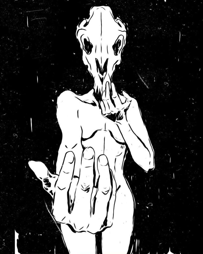
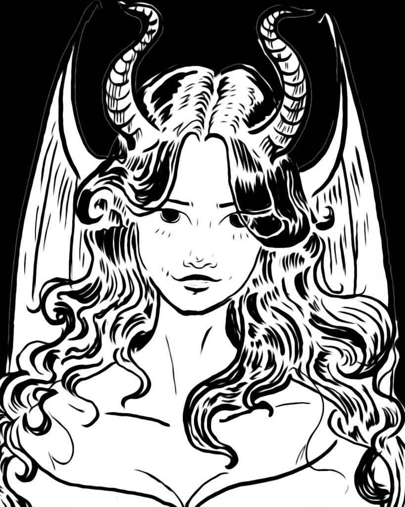
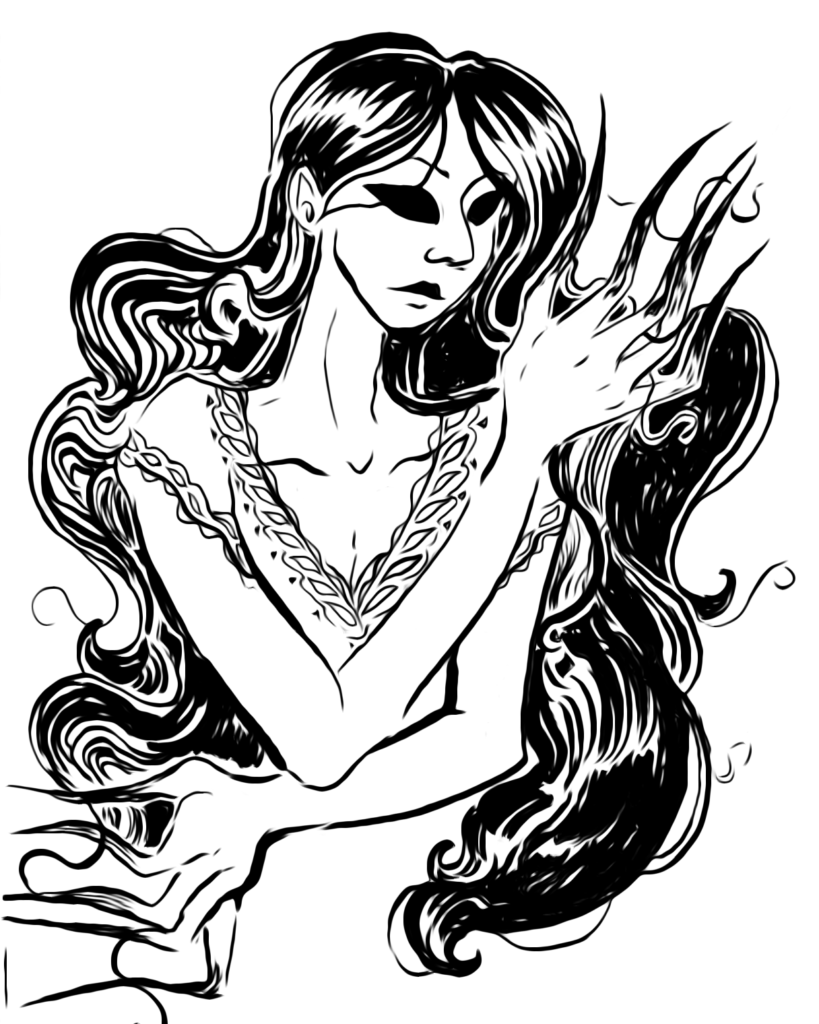
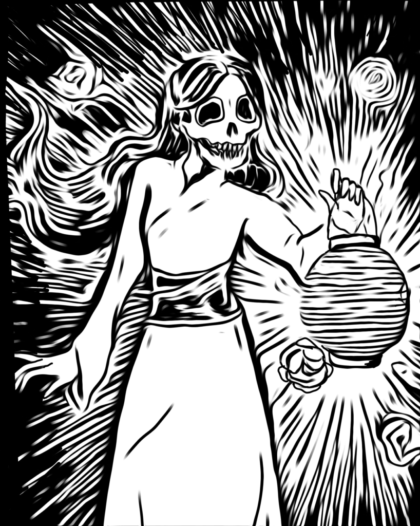


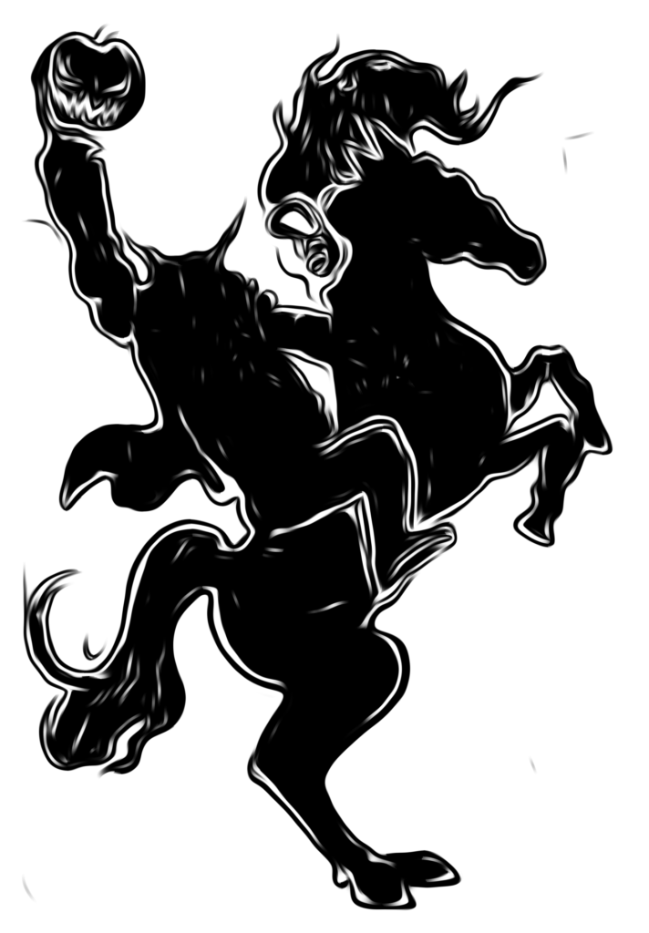


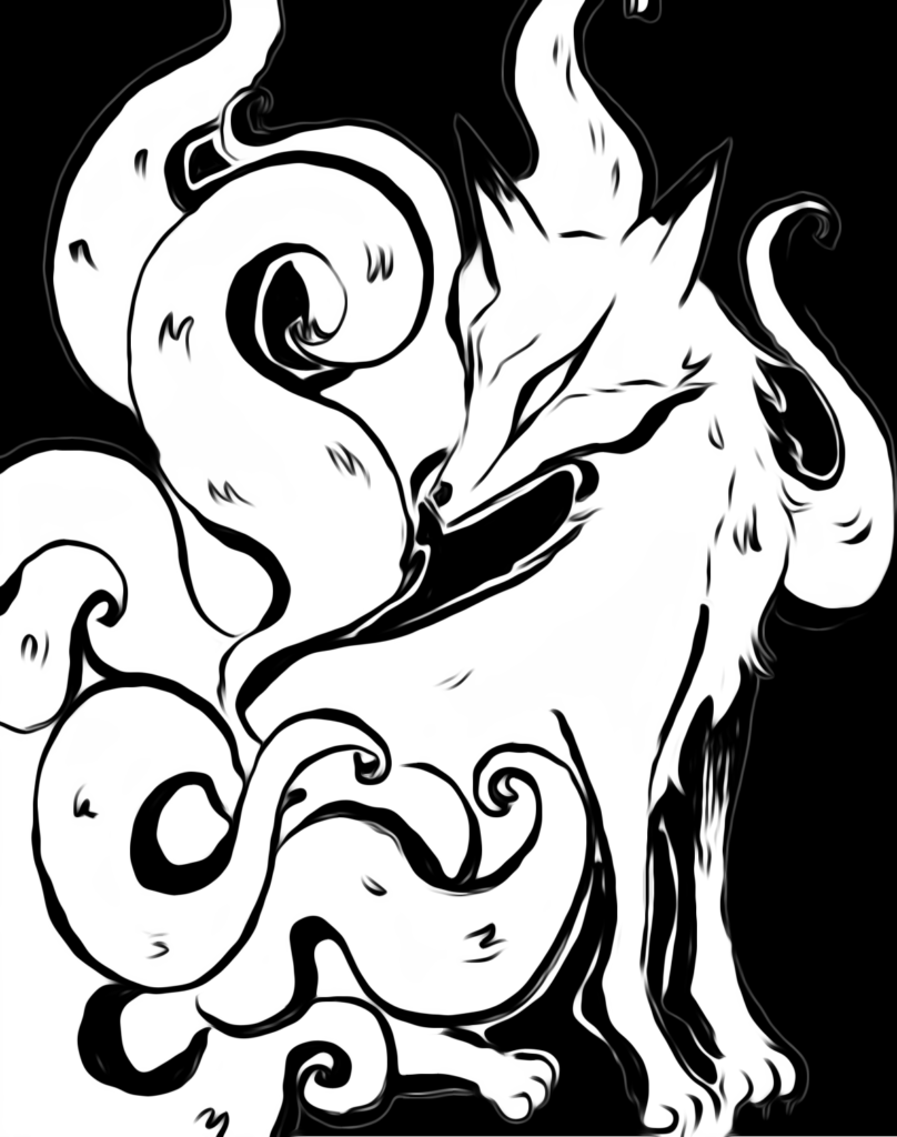
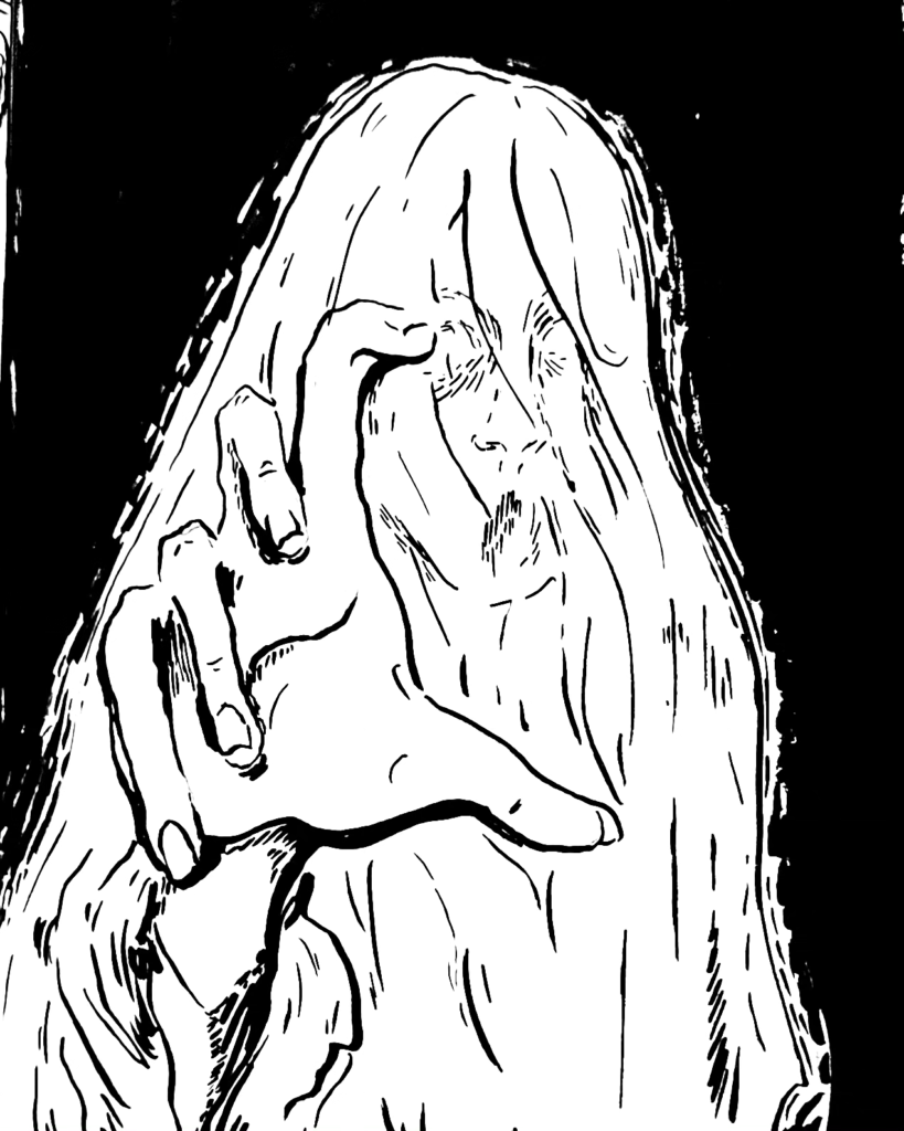


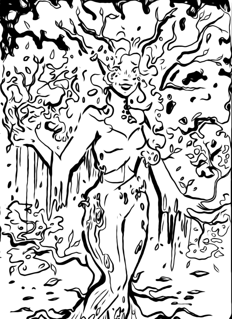

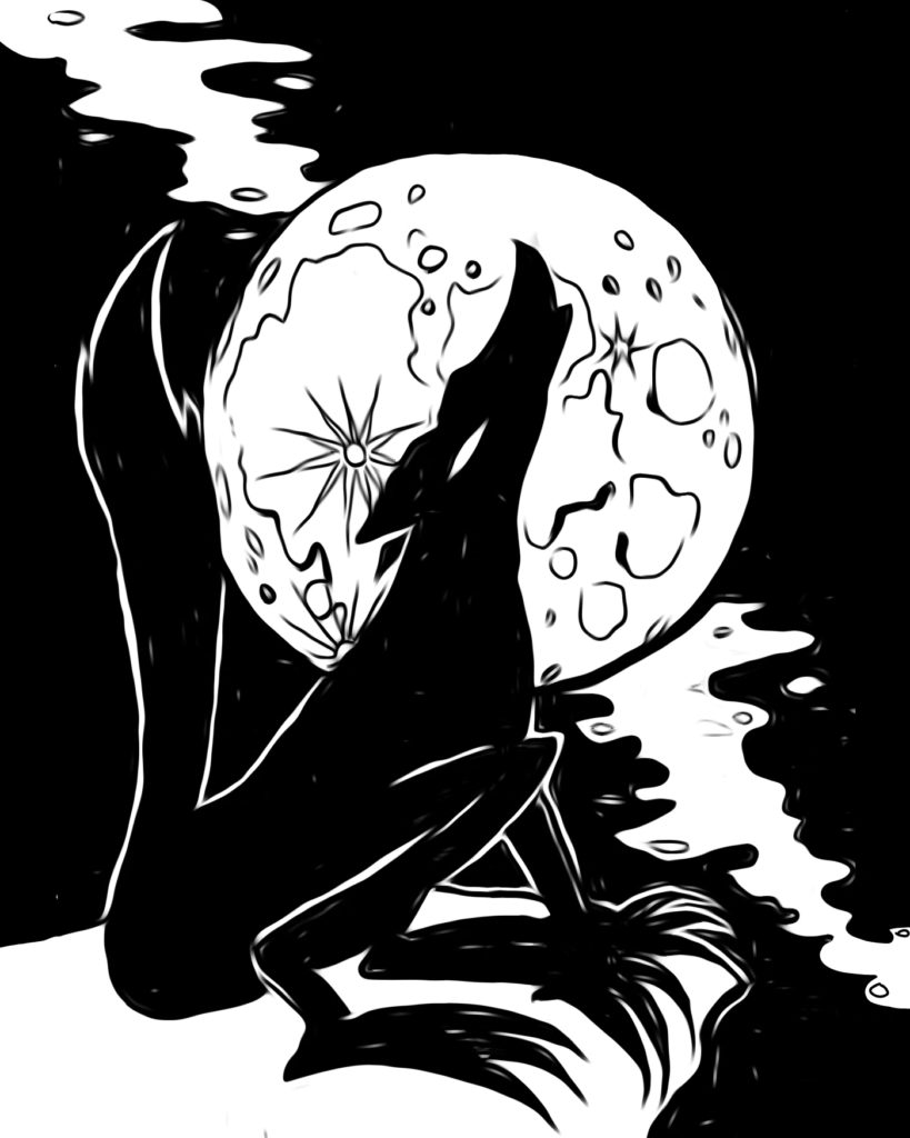


I made a conscious decision to draw all of my inktober sketches in the same sketchbook with the same brush pen and challenged myself to refrain from using a pencil to draw any initial sketches on the page. this was to encourage me to embrace the unknown and work in a way that was loser and more organic. this challenge really helped me tackle my perfectionist mindset.
After completing inktober I decided to have the images from the sketchbook printed into a small book to showcase them. this gave me the opportunity to practice and research printing and publishing my work which came in handy further into this project.


(ABOVE: )sketchbook pages, notes, annotations
The use of a childlike aesthetic for complex themes reflects contemporary trends in children’s illustration. The use of a childlike aesthetic for complex themes reflects a significant trend in contemporary children’s illustration. Books like Shaun tans ‘The Red Tree’ and The lost thing utilize seemingly innocent visuals to grapple with issues like loss, grief, and anxiety. This approach resonates with me because it allows me to create work that is both personally meaningful and emotively engaging. By addressing complex themes through a relatable lens, I aim to erase the stigma surrounding mental health issues and make them more accessible, especially for younger audiences.

My exploration aligns with theories that posit childhood as a formative period where individuals grapple with core concepts like identity, belonging, and emotional well-being.
This aligns with research by developmental psychologists like Louise Bates Ames and colleagues (The Gesell Institute Studies of Child Development), who emphasize the importance of addressing core concepts like identity, belonging, and emotional well-being in children’s literature.Mary Ainsworth’s influential work on Attachment Theory, explored in her book ‘Attachments: A Psychotherapy Study,’ highlights the significance of secure emotional bonds between children and their caregivers for healthy development. (Ainsworth et al., 1978). This theory resonates with my project’s exploration of themes like connection, reconnection, and belonging. The childlike aesthetic allows me to depict these themes in a way that feels safe and relatable to younger audiences, potentially fostering a sense of security and understanding of the importance of strong connections.
Annique Dirks Benton’s research, particularly her work in ‘Developmental Trauma Disorder: The Comprehensive Guide,’ explores the impact of challenging experiences on a child’s emotional and psychological development,(Benton, 2016). While my project doesn’t delve into overtly traumatic experiences, Benton’s research informs my portrayal of loneliness and isolation, emotions that can stem from various difficult situations in a child’s life. By portraying these experiences through a childlike lens, I hope to create a sense of empathy and understanding for viewers who might have encountered similar challenges.

My project contributes to this discourse by utilizing a childlike aesthetic to explore themes of connection, reconnection, loneliness, belonging, and not belonging. These themes resonate deeply in today’s world, where issues of social isolation and a growing sense of disconnect are prevalent.(Fromm, 2006). By portraying these experiences in a nuanced way, I hope to encourage conversations and foster a sense of understanding amongst viewers of all ages.

My project delves into the complexities of the human experience, exploring themes of isolation and the fear of growing up. Scholars like Erik Erikson, who emphasizes the importance of intimacy versus isolation in young adulthood, inform my exploration of these themes (Erikson 1950).
Additionally, Sherry Turkle’s work on feeling alone despite constant connection resonates with the project’s potential for exploring isolation within a connected world (Turkle, 2011).Neil Postman (The Disappearance of Childhood) argues that our fast-paced, media-saturated culture erodes the distinction between childhood and adulthood, contributing to a sense of confusion and anxiety about growing up. (Postman, 1982).This theory aligns also aligns with my project.Furthermore, the project can be seen through the lens of Peter Pan Syndrome, (Coined by Dr. Dan Kiley): This concept describes individuals who resist the responsibilities of adulthood and cling to a desire to remain childlike, (Kiley, 1983). This connects to my project as it explores the fear of losing innocence or facing the complexities of adulthood. However, my approach utilizes a childlike aesthetic not to avoid adulthood, but rather to depict the complexities of growing up in a relatable way.
This exploration delves into a contemporary trend within children’s illustration: utilizing a seemingly innocent aesthetic to navigate complex themes. The influence of works like Shaun tan’s and Carson ellis is evident in the playful imagery that lays the groundwork for progressively mature concepts.
By engaging with this discourse, the project showcases the potential of illustration to create a nuanced experience for viewers of all ages. The childlike aesthetic fosters a sense of approachability, inviting viewers to engage with deeper human experiences like connection, belonging, and isolation in a safe and thought-provoking way.


Creative Process & Problem-Solving:
A crucial aspect of this project involved meticulously crafting a visual language that balanced lightheartedness with more complex themes.
Exploring themes of community and belonging led me to collective nouns as a way to visually represent group dynamics in a creative and engaging way.
I began by selecting playful collective nouns for animals, such as “a business of ferrets” or a “mischief of rats.” These whimsical nouns provided a foundation for the narrative, allowing me to introduce darker and invented collective nouns later in the book, such as a “worry of neurotics” or an “echo of loneliness.” By incorporating elements of these ‘children’s book, gone wrong’ narratives, I aimed to create a book that would resonate with viewers on multiple levels.


The playful collective nouns and textures in the illustrations might initially appear lighthearted, but the thematic progression introduces darker concepts, inviting viewers to engage with the book in a more thoughtful way. This experimentation with visual dissonance reflects my interest in using faux naive, playful visuals to explore deeper human experiences.


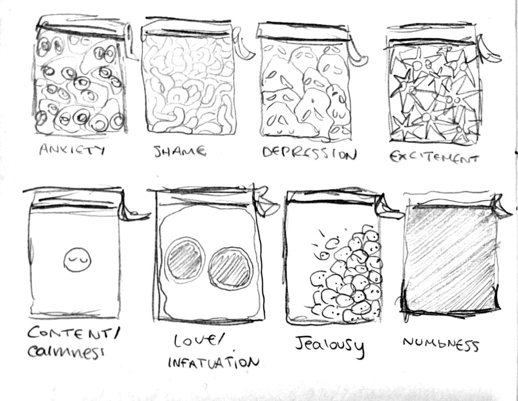
Andy J Pizza’s ‘Invisible Things’ inspired me to think beyond literal representations, encouraging me to personify emotions and abstract concepts. (INSERT IMAGE HERE)
QUESTIONS TO CONSIDER:
-How can I use colours and shapes to show the feelings of “Home” in my drawings?
-Which made-up group names and real ones make me feel certain ways?
– How can I make them better for showing how we belong and who we are?
-When I compare my different “fish out of water” drawings, what do they each make me think or feel?
-How can I draw the feeling of not fitting in?
-How can I combine the ideas of “Home,” “Collective Nouns,” and “Fish Out of Water” to tell a clear story in my project
•What tools or techniques work best for my project? How can I use them to make my work look the most appropriate for my audience and fit the brief/look professional?
•How can I add humour and cleverness to my art, like David Shrigley, to make my pictures deeper and funnier while keeping the feelings in my project?
-What emotions do I want people to feel when they see my drawings?
– How can I make my art look good and feel meaningful at the same time?
– When I show my work to others for feedback, what do they say?
– How can I use their advice to make my project stronger?

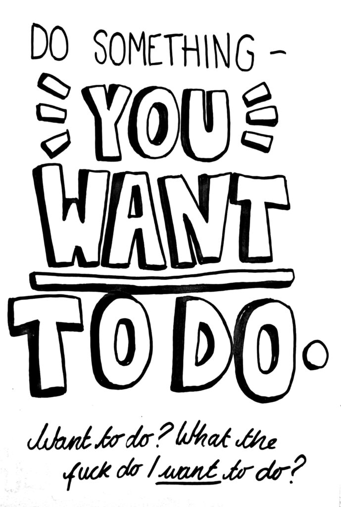
Experimentation played a key role in this process. I explored various media and techniques, including digital and analogue collage, brush pens, and coloured pencils, before settling on a final approach that utilized scanned brush pen sketches rendered and textured digitally, aiming to still maintain an organic, hand drawn appearance.



Critical Reflection:
One of the challenges I faced in this project was striking the right balance between the childlike aesthetic and the mature themes I wanted to explore. Experimenting with different media and compositions helped me achieve this balance. For instance, the use of textures added depth and a sense of intrigue to the illustrations, hinting at the darker undertones without being overtly graphic.
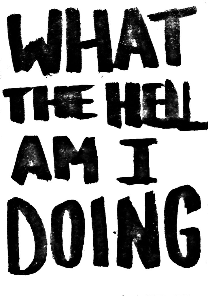
Beyond the balance between visual style and thematic depth, another challenge involved ensuring a cohesive relationship between the text and illustrations. Initially, I experimented with more overtly narrative text, but found it clashed with the evocative nature of the imagery. Ultimately, opting for a more suggestive approach in the text allowed the illustrations to take center stage, inviting viewers to infer meaning and create their own interpretations. This shift not only strengthened the project’s overall coherence but also fostered a more interactive experience for viewers.

The idea was to subvert the expectations of a children’s book, blending innocent themes with darker, more complex narratives.


I experimented with watercolor, ink, and digital textures to create a visually rich and engaging book.
Another hurdle I faced involved striking the right balance between playfulness and poignancy within the childlike aesthetic. While the whimsical collective nouns provided a foundation for engagement, I wanted to ensure the illustrations didn’t become overly lighthearted in the face of the deeper themes.


This was addressed by carefully selecting textures and color palettes. For instance, the use of muted tones alongside whimsical textures created a sense of gentle melancholy, hinting at the complexities beneath the surface.


Defining the target audience for this project also presented a challenge. Initially, I aimed it solely towards children. However, as the project evolved, its thematic depth resonated with adults as well. To accommodate this broader audience, I ensured the narrative remained accessible to younger viewers while incorporating layers of meaning that resonated with adults. This approach resulted in a project with the potential to spark meaningful conversations across generations.




Media & Techniques:
In the initial stages of the project, I experimented with a wide range of media and techniques to establish the book’s visual identity. This exploration included digital and analogue collage, brush pens, fineliners, ink, colored pencils, pencil sketches, digital drawings, paint, colored markers, Riso printing, and stamping.


Ultimately, the final artwork combined scanned brush pen illustrations that were digitally rendered, coloured, and textured.


Textures were incorporated from various sources, including scanned images, real-life texture such as stains and splotches, and even floor/ground closed ups. These textures then inspired the idea to find ,and even create, unique handmade papers with embedded fibers, adding depth and tactility to the final book.
*(Insert images of found textures, and experimental sketch pages)*


Final Outcome.
In crafting this project, I opted for a playful, textured style with organic lines and a muted color palette. This faux naive aesthetic aimed to create a world that felt both whimsical and grounded in reality, inviting viewers of all ages to engage with the illustrations. Through this style, I explored themes of isolation, loneliness, belonging, connection, and the broader human experience – including life, mortality, and even a touch of existentialism.

One of the strengths of this project lies in the unique use of collective nouns. Each illustration stands alone on a page, titled on the following page with its corresponding collective noun. For instance, an image of children playing together might be titled “a mischief of rats,” playfully hinting at a hidden complexity beneath the seemingly innocent scene. This approach allows the illustrations to speak for themselves while prompting viewers to contemplate the unexpected connections between the words and the visuals.
However, the project also presented challenges. Balancing the range of themes proved to be an ongoing process. While some illustrations, like “A Squeeze of Anxieties”, effectively straddled the line between lightheartedness and deeper meaning, others, like “a flamboyance of flamingos,” felt visually distinct from the overall aesthetic and lacked the subtle undertones present in the rest of the series. Integrating these brighter themes more cohesively with the project’s overarching tone could create a smoother visual flow.


Furthermore, the transition between the lighthearted opening and the more somber ending felt a bit jarring. In retrospect, I would have liked to create more content within the middle ground, exploring themes that bridge the emotional gap between the two extremes. This would have provided a more gradual emotional journey for viewers.The text integration also offers potential for further development. While the current separation of image and title works conceptually, there’s room to explore different text styles and placements. Experimenting with using the text itself as a visual element or integrating it within the illustrations could enhance the overall experience.
Moving forward, I envision developing a more comprehensive narrative arc across the illustrations, potentially introducing recurring characters or symbols that guide viewers through the project’s thematic journey. Additionally, creating a full-fledged children’s book prototype would allow for a deeper exploration of text and image integration, pacing, and the overall reader experience. Finally, exploring different printing methods or paper textures could further enhance the unique aesthetic of the project. Overall, this project has been a significant exploration of human experiences through a visually engaging and thought-provoking lens. It has not only allowed me to showcase my potential to create engaging children’s literature but also highlighted areas for further growth and experimentation within my artistic practice.
*(Insert images of final outcome)*


Personal Direction & Professional Application:
This project aligns with my ongoing exploration of themes related to belonging. It also reflects my interest in pursuing a potential career in publishing, particularly children’s publishing. The book’s use of a childlike aesthetic to address complex issues demonstrates my ability to engage a younger audience while simultaneously conveying deeper meaning. Furthermore, the project’s successful marriage of visual metaphor and thematic exploration highlights my ability to critically evaluate research findings and utilize them to inform creative visual responses, a key learning outcome in this course.
This project feels like a culmination of my long-standing fascination with the concept of belonging—or the lack thereof. Growing up, I often felt like an outsider, struggling to find my place in the world. This project became a personal exploration of these feelings, utilizing a childlike aesthetic to navigate complex themes of connection, isolation, and the ever-shifting sense of self in young adulthood.
Furthermore, it directly aligns with my aspirations for a career in children’s publishing. I believe children’s literature has the unique power to address challenging emotions and complex realities in a way that feels safe and relatable for young readers. By utilizing a playful aesthetic alongside deeper thematic exploration, this project aims to provide a space for children to explore these concepts at their own pace, fostering empathy and understanding for themselves and others. The challenge of successfully marrying visual metaphor with thematic content pushed me to critically evaluate research findings on child development and the role of illustration in fostering emotional literacy.
Ultimately, this project represents a significant step forward in my artistic journey, allowing me to develop my skills as a visual storyteller and further solidify my passion for creating meaningful work for young audiences.
